

OVERVIEW
Atlassian offers free 30 day trials of its team collaboration and software development tools. I lead a service design initiative aimed at improving the holistic onboarding support experience.
Project Team
I worked alongside a senior product designer, an internal product manager, and multiple developers on the support enablement team. I gathered usability feedback on the then-current forms and support request processes directly from customers and internal stakeholder teams (customer success and product specialists).
My Role
Research: interviews with customers and support team
Ideation and wireframing
Usability testing
Workshop facilitation
Impact analysis and reporting
Product strategy
GOAL
Redesign a cohesive, multi-channel new user support journey enabling Atlassian's product operations teams to:
Reduce efforts spent on repetitive questions through informed automation and redirection
Increase customer feedback volume and quality to better inform ongoing improvements to the support process, our internal application stack, and agent training.
CHALLENGES
One form, multiple help teams
At the time of the project's inception, customers could send questions to Atlassian product specialists via the website's general contact form, which was shared with several other of the company's customer-facing teams (technical support, customer success, event marketing). Submitting the form (assuming customer filled out the correct fields) created a JIRA Service Desk ticket for the Atlassian product specialist team.
Atlassian’s product help / sales help form (before redesign)
Unlinked resources
A separate site (confluence.atlassian.com) housed all technical documentation and help articles for each of Atlassian's products, but links to these articles from the existing contact form were outdated (referenced previous versions of the tools) and had low click through rates (lack of links from drip feeds and help pages).
Surveys: too much, too late
Customers received an email inviting them to complete a satisfaction survey shortly after the support case was resolved, or after 5 days of customer inactivity. We hypothesized that both the length of the survey (11 questions long) and the time delay before the survey email caused a low average response rate (~5%).
APPROACH & IDEATION
Self-helpers vs. Support-seekers

Customers we observed interacting with the contact page fell into two distinct groups:
Self-helpers were adamant in finding the answer to their product question themselves by searching for helpful articles on the site.
Support-seekers paid little attention to linked documentation and submitted the contact form straightaway.
How could we be more effective in 1) getting self-helpers to the correct help content faster, and 2) get support-seekers to the right team, quicker?
Solution Thinking vs. Underlying Issues
Naturally, members of the customer-facing Atlassian teams had a slew of feature suggestions for improving the form and survey — it’s their job to suggest solutions! I decided to run participatory design sessions with nominated “champions” from each customer facing team, alongside our designers and PM, to better consolidate and collect their input for the redesign. In some cases, we worked backwards to uncover how feature requests (“link to the to the top 5 articles per product”) revealed underlying needs (“Why aren’t customers discovering them sooner?”).
PROTOTOTYPE
Promote resources above the fold
We proposed placing links to landing pages of popular resources atop the contact page (above the form) would reduce inquiries easily answered by documentation and product videos.
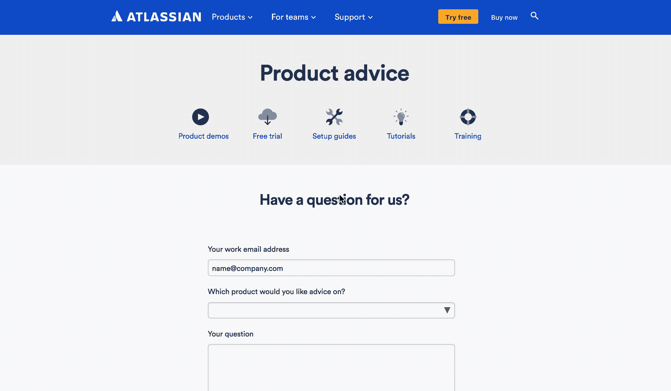
Request-specific forms and fields
We proposed moving from a single form to 3 separate forms, mapped to each support team (licensing, product advice, and technical support). I also sought to weed out unnecessary user inputs by removing excess fields, including Organization (gathered from email address and/or Salesforce) and Timezone (detected by IP).
Leverage machine learning, suggest answers in-line
We began testing integration with a 3rd party machine learning platform, Solvvy. Based on past ticket history and updated knowledge base articles, Solvvy allowed us to auto-suggest answers to customer’s most common questions from within the contact form. We also began leveraging conditional fields and suggesting help content and links in-line based on field inputs.
Shorter, timelier surveys
To help encourage higher survey response rates, we followed a similar approach: eventually reducing the # of questions from 11 to 3, then adding form logic to ask for areas of improvement only if end user gave a low score on question #1.
Early prototype: included a 5 point scale; reasons for score exposed by default
Later prototype: 10 pt NPS scale; conditional logic and required fields added
TEST & ITERATE
Shipped! Contact Page 2.0
The redesigned contact form underwent additional internal testing, then a period of segmented A/B testing live on the Atlassian website over the course of a quarter before being deployed to atlassian.com.
IMPACT
The redesigned contact form enabled our product specialist team to allocate more time and effort to complex or time-sensitive product inquiries, rather than repetitive questions easily answered by existing documentation. The results were measurable:
Reduction in lower priority inquiries (as % of total tickets)
Increased % time spent on P1 and P2 tickets
Increase in average CSAT scores across P1 and P2 tickets
Next Steps
Phase 2 would focus on building out the top-level resource links into a navigable / hierarchical menu structure similar to what we had already implemented for the billing support team. We later began testing user profile-triggered live chat support.
